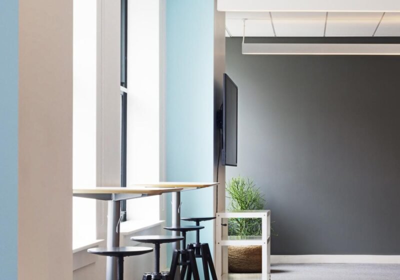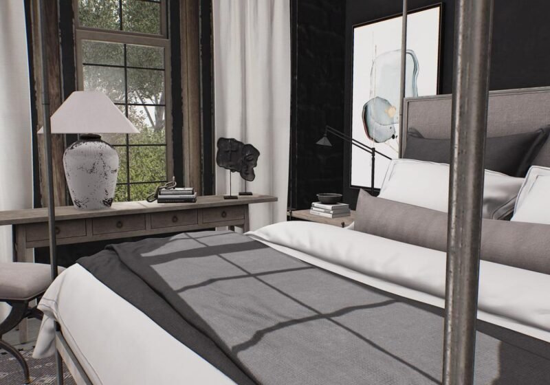
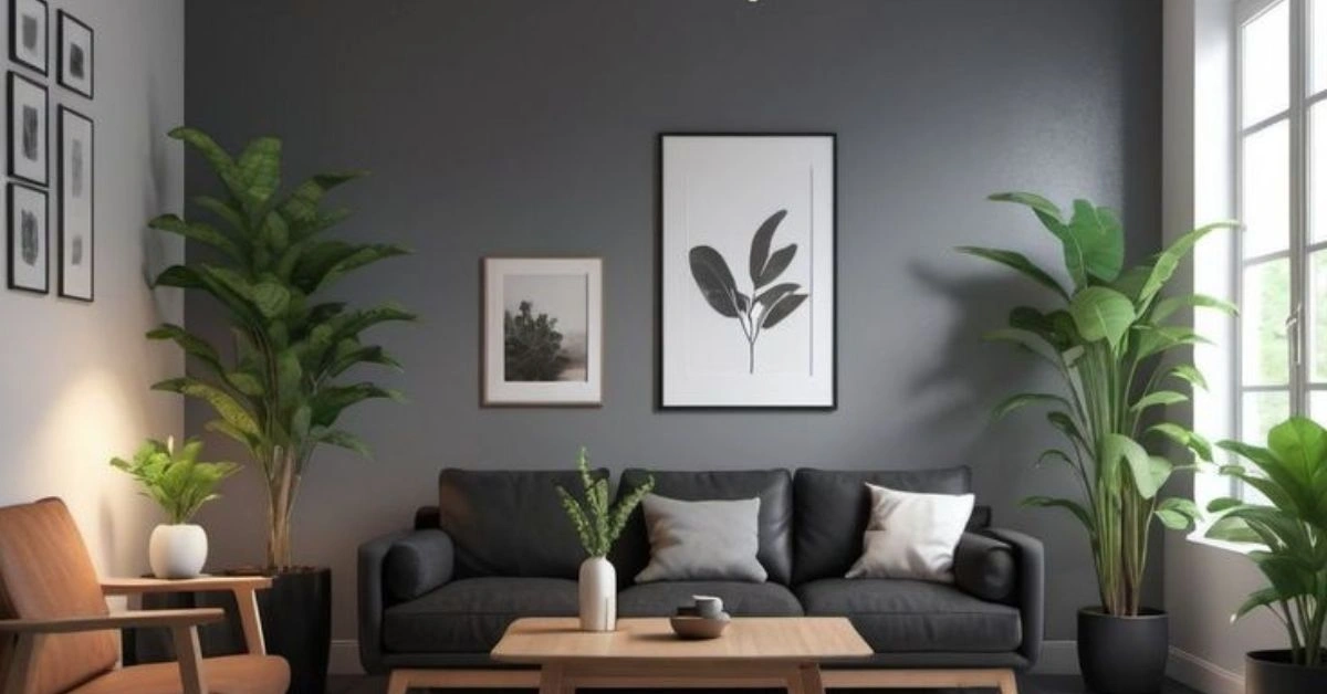
Room Painting Ideas for the Living Room are the foundation of a thoughtful, well-planned space. This comprehensive guide brings together everything our editors have learned about Room Painting Ideas for the Living Room, from layout and lighting to materials, finishes and budget-friendly upgrades, so you can make confident decisions and avoid the costly mistakes we see repeated in homes every year. Whether you are starting a full refurbishment or simply refreshing a tired room, the Room Painting Ideas for the Living Room covered here will help you get the most from your space, your budget and your time.
Room Painting Ideas for the Living Room: Why the Living Room Paint Choice Matters More Than Any Other
The living room is, in most UK homes, the room that gets used the most and seen the most. It is the room where you collapse after work, where friends congregate on a Friday night, where the family piles in on a Sunday afternoon, and where you sit in the dark at 11pm wondering whether the magnolia really was such a great idea after all. Yet for all this use, the living room is often the last room to be redecorated, and the paint colour is often chosen in a panic after a weekend of staring at colour charts.
Table of Contents
The right paint colour can transform a living room. It can make a north-facing room feel warmer, a small room feel bigger, a cluttered room feel calmer, and a featureless room feel like somewhere you actually want to spend time. The wrong paint colour will do the opposite of all those things, and you will be looking at it every day for the next five years.
This guide brings together 25 living room colour schemes and painting ideas that have been tested in real British homes. None of them are particularly trendy or outlandish, because the truth is that the most successful living rooms are the ones that have been decorated for how the room is actually used, not for how it looks on Instagram.
Start with the Light
Before you even look at a colour chart, you need to understand the light in your living room. Light is the single biggest factor in how a paint colour will read, and getting it wrong is the most common reason for living room redecoration regret.
North-Facing Rooms
North-facing rooms get the coolest, flattest light in the house. Whites can look grey and clinical, blues can look icy, and anything described as “warm white” on the swatch will be anything but on the wall. The solution is to lean into the light and choose colours that work with it. Soft yellows, warm pinks, terracotta, and earthy reds all glow in north light. A touch of cream, peach or butter yellow in a north-facing living room can feel like sunshine on a cloudy day.
South-Facing Rooms
South-facing rooms are a gift. They get strong, warm light for most of the day, which means almost any colour will work. Cool whites, soft greys, blues, greens and lilacs all sing in south light. The only colours to be careful with are very bright, saturated tones, which can become almost luminous in strong sun and feel exhausting to live with.
East and West-Facing Rooms
East-facing rooms get lovely morning light but can feel cold by evening. West-facing rooms are the opposite. Both need a colour that works in two different light conditions, which is where mid-tone neutrals come into their own. Soft greys, gentle greens and muted blues tend to be the most forgiving.
25 Living Room Colour Schemes That Work
Rather than a single, prescriptive recommendation, here are 25 colour schemes that have worked well in real UK living rooms. Sample each one before committing, ideally at different times of day, and remember that paint always looks slightly different on a wall than on a swatch.
Soft, Calming Neutrals
1. **Dulux Egyptian Cotton** with **Off-White Woodwork** – a gentle, warm neutral that suits north-facing rooms and feels quietly elegant. 2. **Farrow & Ball Ammonite** with **Strong White Ceiling** – a sophisticated grey-green that is endlessly versatile and works in almost any light. 3. **Mylands Hoxton Blue** with **Ivory Woodwork** – a soft, slightly muted blue that feels calm without being cold. 4. **Little Greene French Grey Mid** with **Slaked Lime Woodwork** – a balanced grey that works beautifully in both modern and period homes. 5. **Dulux Natural Hessian** with **White Cotton Ceiling** – a warm, earthy neutral that adds depth without being heavy.
Warm, Cosy Colours
6. **Farrow & Ball Setting Plaster** with **Pavilion Blue Woodwork** – a dusty pink that feels warm, grown-up and very current. 7. **Dulux Spiced Honey** with **Soft Cream Woodwork** – a warm caramel tone that glows in north light. 8. **Farrow & Ball India Yellow** with **Black Woodwork** – a confident, joyful yellow that makes a real statement. 9. **Mylands Belgravia** with **Off-Black Woodwork** – a sophisticated terracotta that feels grounded and warm. 10. **Little Greene Windmill Lane** with **Roman Plaster Woodwork** – a soft, earthy red that works in both modern and period properties.
Cool, Restorative Colours
11. **Farrow & Ball Pigeon** with **Ammonite Woodwork** – a much-loved blue-grey that is genuinely relaxing to live with. 12. **Dulux Denim Drift** with **White Cotton Woodwork** – a soft, slightly muted blue that feels calm and never cold. 13. **Mylands Pimlico Green** with **Ivory Woodwork** – a deep, sophisticated green that works particularly well in libraries and studies. 14. **Farrow & Ball Inchyra Blue** with **Shaded White Woodwork** – a moody, atmospheric blue that is perfect for evening rooms. 15. **Little Greene Hicks’ Blue** with **Slaked Lime Woodwork** – a soft, slightly grey blue that suits both modern and period homes.
Bold, Confident Colours
16. **Farrow & Ball Hague Blue** with **All White Woodwork** – a deep, dramatic blue-green that makes a real statement. 17. **Dulux Sapphire Springs** with **White Cotton Woodwork** – a rich, saturated blue that is surprisingly versatile. 18. **Mylands Buckingham Green** with **Off-White Woodwork** – a confident, traditional green that feels timeless. 19. **Farrow & Ball Salon Drab** with **Pavilion Blue Woodwork** – a sophisticated, slightly green brown that is endlessly characterful. 20. **Little Greene Theatre Red** with **Slaked Lime Woodwork** – a bold, dramatic red that is perfect for panelled or formal rooms.
Quietly Modern Schemes
21. **Farrow & Ball Cornforth White** with **Purbeck Stone Woodwork** – a soft, modern neutral that feels warm without being beige. 22. **Dulux Timeless** with **Pure White Woodwork** – a barely-there grey that works in any light and with any decor. 23. **Mylands Holland Park** with **Ivory Woodwork** – a sophisticated, slightly green grey that feels calm and modern. 24. **Little Greene Quietness** with **Slaked Lime Woodwork** – a soft, slightly blue green that is endlessly versatile. 25. **Farrow & Ball Elephant’s Breath** with **Ammonite Woodwork** – a much-loved warm grey that works beautifully in north light.
Painting Techniques That Add Interest
A single colour on four walls is fine, but a little painting technique can elevate a living room from pleasant to genuinely interesting.
Feature Wall
The classic feature wall, in a contrasting colour or with a different finish, is back in fashion after a long stretch in the wilderness. The key is to choose a wall that has a natural reason to be the focus: the one with the fireplace, the one behind the sofa, or the one that catches the best light. Avoid painting a random wall that has no architectural significance; the result will look confused rather than considered.
Two-Tone Walls
A simple but effective technique is to paint the lower third or lower half of the wall in one colour and the upper portion in another, separated by a dado rail, a picture rail or a simple painted line. The darker colour on the lower portion adds weight and grounds the room; the lighter colour above opens it up.
Panelled Walls
If you have wall panelling, painting the panels and the woodwork in the same colour creates a more contemporary, architectural look. Painting the panels in a contrasting colour to the wall above is a more traditional look that works beautifully in period properties. Either way, panelling plus paint is a combination that adds real depth to a living room.
Colour-Blocked Walls
Colour blocking, where a single wall is divided into two or more blocks of contrasting colour, is a more modern, designer-led look. It can be hugely effective, but it requires a confident eye and a willingness to live with something a bit different. Sample the colours at full size before committing.
Practical Painting Tips
A few practical tips from professional decorators that will save you time and money:
- **Always use a primer on new plaster or bare wood.** Without a primer, the paint will soak in unevenly and you will need twice as many coats.
- **Use a quality brush and roller.** Cheap tools shed fibres, leave marks and generally make the job harder. A good synthetic brush and a medium-pile roller are worth the small extra cost.
- **Cut in first, then roll.** Cut in around the edges, corners and woodwork with a brush, then immediately roll the main wall area. Working in small sections (around 1m wide) keeps the edge wet and prevents visible lines.
- **Two thin coats are better than one thick coat.** Thick paint sags, marks and takes longer to dry. Two thin coats give a smoother, more durable finish.
- **Don’t paint in direct sunlight.** The heat makes the paint dry too quickly, which leads to brush marks and visible overlaps.
Frequently Asked Questions
Q1. What is the most popular living room paint colour in the UK?
Warm greys and soft greens are consistently the most popular living room colours in the UK, with Farrow & Ball Elephant’s Breath, Pigeon, and Ammonite appearing on countless Pinterest boards. White, magnolia and cream remain the most-used overall, but among homeowners actively choosing a colour, warm neutrals dominate.
Q2. Should I paint the living room the same colour as the hallway?
It is fine to paint the living room and the hallway the same colour, particularly if both rooms are visible from the front door. A continuous colour creates a sense of flow and makes the hallway feel more spacious. Alternatively, use two related shades of the same colour to create subtle variation between the spaces.
Q3. How do I choose a paint colour for a small living room?
For a small living room, the safest options are light, warm neutrals that reflect light and read as more space. Avoid very dark or very saturated colours on all four walls, although a feature wall in a deeper colour can work if balanced with lighter tones elsewhere. Aim for contrast with the furnishings rather than the walls.
Q4. How much paint do I need for a living room?
As a rough guide, a standard UK living room of around 4m by 5m with 2.4m ceilings will need approximately 10 to 12 litres of emulsion for two coats. A more accurate calculation is to measure the wall area (length times height, summed for each wall), multiply by two for two coats, and divide by the coverage rate of the paint (typically 10 to 14 square metres per litre for emulsions).
Q5. Is it worth hiring a professional decorator?
For a single room with reasonable access and no specialist finishes, a competent DIYer can achieve a perfectly good result. For whole-house redecoration, high ceilings, period features, or any finish that requires spraying, a professional decorator is well worth the cost. They will typically charge around £150 to £250 per day, and a full living room should take one decorator two to three days.
Conclusion
Choosing a living room paint colour is one of the most personal design decisions you will make. The colour you live with will affect your mood, your energy and your enjoyment of the room, so it is worth taking time to get it right.
Sample colours at different times of day. Live with test patches for a few days before committing. Trust your instincts rather than the latest trend. And remember that the most important thing is not the specific colour, but whether it feels right to you in the room where you actually live.
Related Articles You May Find Useful
Continue exploring the topic with these hand-picked guides from our editorial team.
- units for the living room (UK)
- living room colour ideas (UK)
- grey living room ideas (UK)
- live room colours (UK)
- living room with panels (UK)
Further Reading and Trusted Sources
For more inspiration and expert advice, see the latest from Real Homes — expert UK home renovation advice.
For more inspiration and expert advice, see the latest from Ideal Home — British decorating and interiors inspiration. Put simply, the right Room Painting Ideas for the Living Room can transform how a room looks, feels and functions — and that is exactly what we hope this guide helps you achieve.